Opposites +
|
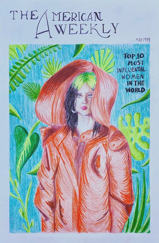
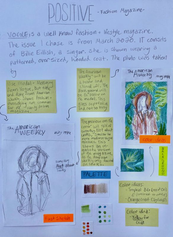
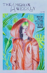
Influential 25.5cm x 38cm Color Pencil on Illustration Board November 2020 Influential is one of a two part collection of opposites, this one being more positive. Here I used two different magazine covers from different centuries that had contrasting messages. I used the model and messages from a 2020 VOGUE issue, while the date and title of the magazine was used from 1944 The American Weekly. I wanted to show how the media intended for women has changed. |
Inspiration

Ethan James Green VOGUE cover March 2020
|
My two inspirations were magazine covers are the notorious VOGUE and The American Weekly, now Charm magazine. Ethan James Green photographed Billie Eilish for VOGUE's March 2020 issue. The singer was on the cover due to the storm she has created in the music industry, or as the issue cover revivals, how she "Reinvented Pop Stardom". More recent issues of VOGUE have left behind the old idea that beauty is everything. Now VOGUE focuses on lifestyle and fashion instead, this March 2020 issue is an example. I wanted to use someone not associated with typical beauty norms, like Billie Eilish. Her often over sized baggy clothes is in strong contrast to what was worn in the 1940's. |
|
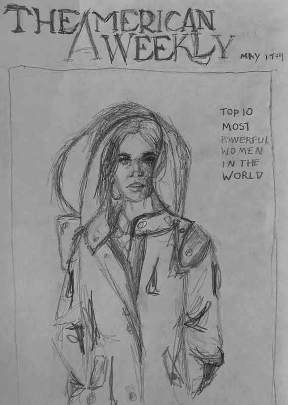
My other inspiration was another magazine cover from The American Weekly, May 1944. Or more commonly known as Charm magazine. Being that the issue was released in another time period that has contrasting views to more modern media, I though this was a perfect way to compare the two. Charm always had more of a vanity driven focus. To the right is some of David Wright's work. I used his artistic style, he used in the 40's, for inspiration. I determined that the softer and realistic look of the models he portrayed would deliver my intended message that there would have never been a piece of media saying anything about women like this. I also thought that the way the fabric is depicted on the model in The American Weekly cover, there is many lines and shapes showing the folds and shadows. This was a big part of my inspiration.
|
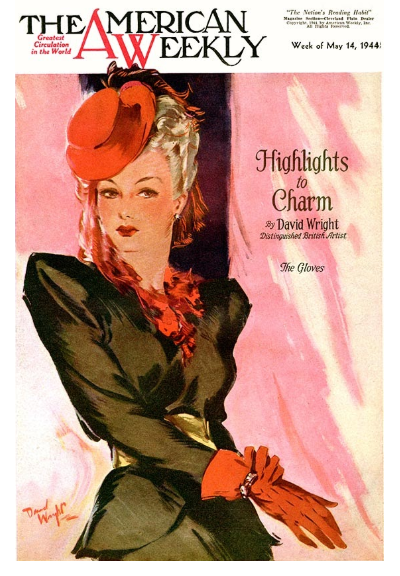
The American Weekly Charm May 1944 Cover By David Wright
|
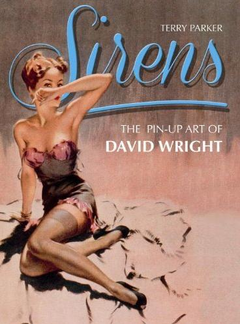
Sirens Book of David Wright's pin-up art
by Terry Parker |
Planning
|
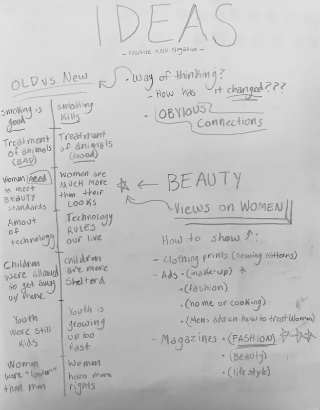
I knew from the beginning I wanted to compare older ideas and concepts to modern thinking and views. I also wanted to depict how older ideas v.s. modern ideas have changed, or have not changed. My overall concept was that older media emphasized that women and girls must follow and meet the beauty standards, while most modern media communicates that women are much more than their looks, and can do much more. After deciding on my message I wanted to find a form of media that influences the population and has a wide range of views. I decided on magazine covers because they are simplistic and get to the point about the topics and purpose of the text. |
|
|
For this work I wanted a more positive look, and almost dream like. This was to emphasize the unrealistic aspect of the work in it's intended time. I planned to achieve this by using the model and messaging from the VOGUE issue, but title and date from The American Weekly. The message, or the preview on the cover, will not be about vanity, like seen in 1944, but more about women can do, or their achievements. this align more with modern VOGUES' intended purpose. That illustrates an unrealistic vision of the old magazine as it solely focused on looks. The header/title being closed off from the illustration makes it look more like The American Weekly cover and to add a contrast from the saturated illustration and make it less busy. I planned to make the background the pattern of the coat, this way it would be less messy and would also add to the background not being so boring. |
|
Experimentation
|
I experimented with the techniques I used. At first I wanted to use David Wright's light and soft looking style, but instead opted to use an exaggerated version of the sketchy look David Wright uses in The American Weekly May 1944 issue. For this I used rapid movements of the pencil to create the lines. These lines illustrate the folds and shadows of the dress. This was a stylistic choice on my part. I really just enjoyed exaggerating how the fabric flows on the model. |
Process
|
|
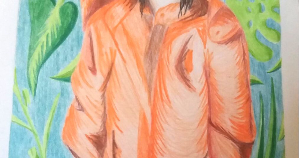
I stared off by drawing my reference lines so I had an idea of where all the color should go. I did his by lightly sketching. I then created the tropical vegetation, seen on the model's coat, in the back ground. I added some flatter shapes, but also some leaves with more dimension. Then I started to lightly shade in the main color of the background. In between finishing the background I layered different tints and shades of brown/tan to create the skin on the neck. After that I layered oranges and browns (dark orange) to create the coat. |
Reflection

|
I have improved as an artist by learning new skills and learning how to use colored pencils in a new way. I gained inspiration on how to improve from David Wright's work. Looking at the techniques he used in the work and by exaggerating the lines and shapes I produced my own take on the early 1900's style. Learning how to effectively use colored pencils was challenging because I have never used them in that way before. I also think that keeping the work consistent was challenging. I enjoyed coming up with the idea and forming my own opinion on the matter, but as I found it challenging I did not enjoy working with the medium. Even though I am not in love with this work I want others to take away that even though the media has changed some, it is still geared towards vanity, looking perfect, following the beauty standards. This creates problems that are visible in young girls and women all over, especially in the U.S.. There is more to a person than looks.
|
Critique
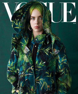
Ethan James Green VOGUE cover March 2020
|
Similarities:
-The model and orientation is the same in both works -Both use a tropical aspect Differences: -One is photography, while the other is Color Pencil on Illustration Board -The feel is very different in the works, the official VOGUE cover is mysterious with the lighting on her face cut off and the dark background, but is also tame in the almost monotone palette. While my work is much more vibrant and has a less of a gloomy look, but a positive one with the colors and background. |
Influential
|
|
ACT Responses
|
Bibliography
|
|
) Clearly explain and describe how you are able to identify the cause-effect relationships between your inspiration and its effect upon your artwork.
My inspiration was David Wright and Ethan James Green, their work influenced me in terms of process and formulation of my art. Their work led me to new conclusions about . 2) What is the overall approach the author has regarding the topic of your inspiration? The authors from my sources were all very enthusiastic about the topics; that being David Wright, Billie Eilish or vintage magazine covers. They were knowledgeable and gave a new insight into the topics for me. 3) What kind of generalizations and conclusions have you discovered about people, ideas, cultures, etc. while you researched your inspiration? I have developed my own opinion on the way women were portrayed in the early 1900's media and today's media. A generalization I have come to is that women were treated as if their beauty only mattered, and things have not changed very much today. 4) What was the central idea or theme around your inspirational research? The theme was connections to the portrayal of women in the media and the connection between older forms of media to newer. 5) What kind of inferences (conclusions reached on the basis of evidence and reasoning) did you make while reading your research? While reading and doing research I concluded that not to much has changed in what the media tells women, and that vanity is still considered very important; in most modern media. |
Haskell, R. (2020, February 3). How Billie Eilish Is Reinventing Pop Stardom. Retrieved November 29, 2020, from https://www.vogue.com/article/billie-eilish-cover-march-2020
Jang, S. (2017, February 14). Sirens: The Pin-Up Art of David Wright. Retrieved November 29, 2020, from https://retrenders.com/2013/10/02/sirens-the-pin-up-art-of-david-wright/ MagazineArt.org, N. (2009). American Weekly 1944-05-14. Retrieved November 29, 2020, from www.magazineart.org/main.php/v/general/massweeklies/americanweekly/American+Weekly+1944-05-14.jpg.html The Moscow Times, N. (2020, November 29). 16-Year-Old Russian Artist Lands Vogue Cover With Billie Eilish Drawing. Retrieved November 29, 2020, from https://www.themoscowtimes.com/2020/02/04/16-year-old-russian-artist-lands-vogue-cover-with-billie-eilish-drawing-a69154 |
