
Painting Based on Photography

|
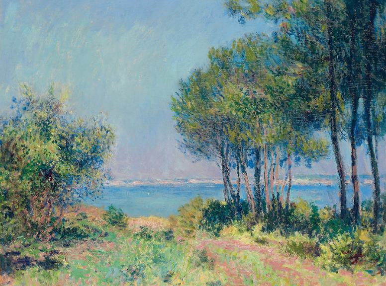
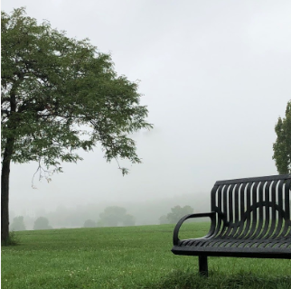
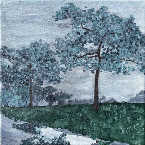
Trees of the Lake 30.5cm x 30.5cm Acrylic on Canvas October 2020 Trees of the Lake is based on a section of a photography piece of mine: Sunny. In this painting I used Monet’s famous use of impressionism. I used impressionism to portray and exaggerate the gloomy mood seen in Sunny. Unlike Sunny, Trees of the Lake has more natural elements and has no connection to the industrial ideas behind Sunny. With Trees of the Lake I wanted to show a more of a calm mood, with a familiar feeling. This is illustrated through the almost monochromatic palette. |
Inspiration
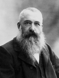
Claude Monet
(1840-1926) |
Claude Monet is one of the world most famous painters, and for one main reason: his use of impressionism. He made many paintings with this technique. He would use small little lines and dashes of paint to create an image. The paintings done in this style are no Baroque painting, but capture the subject with light and color. This technique has been used by Monet for many nature scenes. Monet's work had helped me solidify my ideas for my painting. With his works I finalized my theme of a familiarity, and his work inspired me to also use the impressionistic style he was famous for. One example is Impression Sunrise (shown below), which really caught my eye and reminded me of my photography work: Sunny. The fog displayed, combined with the use of nature and industrial components can be seen in Impression Sunrise and Sunny. Impression Sunrise also has the streaky look to it created by many horizontal brush strokes and many other smaller ones. This technique and how it was applied to the famous painting really brings out the subject matter. The fog and haze, the water, the boats, the blazing sun. This was something I wanted to somewhat apply to my own painting.
|
Fir Trees at Varengeville (1882)
|
Another one of Monet's works that inspired me was Fir Trees at Varengeville (shown on the left). In this painting there are many trees and an asymmetrical balance of the work; created by the framing of the work, which cuts off some of the vegetation. This shows that there is much more greenery not in frame. This reminded me of my picture. I also thought that Fir Trees at Varengeville has a detailed way of showing the plants without going too much into detail and still using the style of impressionism. The application of the small brush strokes for leaves had given me an idea of how to paint the leaves in my own painting.
|
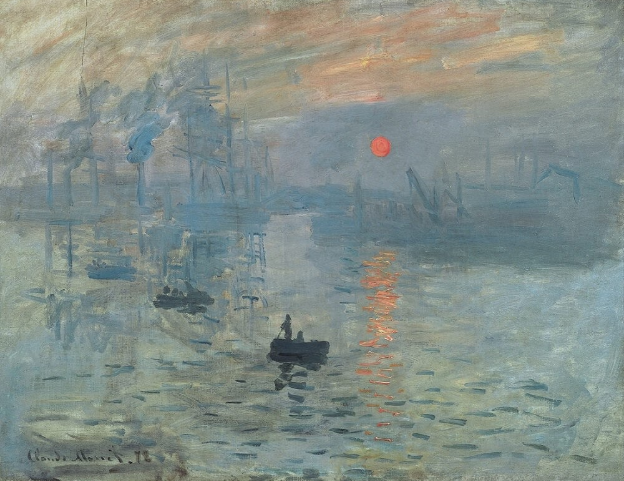
Impression Sunrise (1872)
|
Planning
|
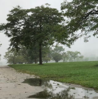
The first step I took was that I worked with different sections from Sunny to paint. At first I wanted to include the chair to get the industrial aspect. Similar to Michel Kenna's The Rouge Complex Dearborn, Michigan collection. I then decided to go in a different direction and solely focus on the more natural aspects of the picture. By focusing on the nature in the picture I then narrowed down my subject area to paint. I decided on the final image presented on the left. I chose this one because I think it has an interesting layout, cutting off some of the foliage, while still keeping the main subject matter noticeable.
|
     |
|
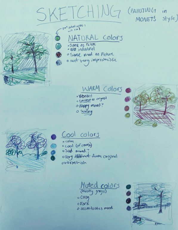
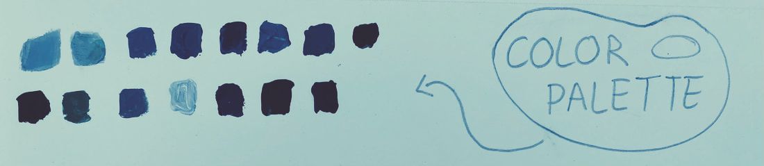
I then created an example palette I could reference back to. It contains mostly gray and green tones (shown on the bottom left). Here are the base colors that are muted and are not that vibrant. Most of the hues are made of gray with other hues added to them. This gives a similar look across the whole palette, and then in turn the whole painting.For the next step I wanted to do was decide what type of color palette. I had four possible hue themes (shown on the top left): a palette that consist of all the original hues from the picture; a palette with only warm hues; a palette with only cool hues; a palette with muted hues that were similar to the original colors. In the end I selected the muted palette. My initial thought was to do mostly grays and dulled down colors. I chose this because the softer tones would create a more relaxed feeling, and in turn a more familiar feeling. I then created an example palette I could reference back to. It contains mostly gray and green tones (shown on the bottom left). Here are the base colors that are muted and are not that vibrant. Most of the hues are made of gray with other hues added to them. This gives a similar look across the whole palette, and then in turn the whole painting. |
Experimentation
|
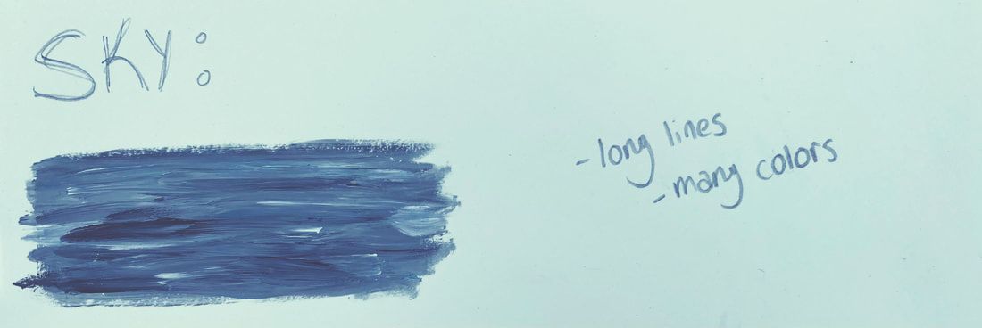
I experimented with which techniques I used. With my main inspiration being Impression Sunrise I wanted to recreate the techniques used in that painting. Many of the shapes that are in Impression Sunrise are created by horizontal lines. I wanted to see if I could use this technique in my own work. So after I created my palette I used those colors to test how the paint would be used to create the same look that Monet's famous painting shows. I wanted to show the long vacant and vast sky and how that illustrates a similar feel across the whole work. I wanted to show this with horizontal lines (shown to the right).
|
|
|
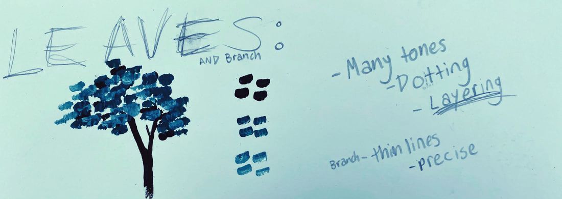
I also experimented with techniques demonstrated in Fir Trees at Varengeville. In that painting there is a lot of vegetation. Monet uses many tiny brush strokes. So I wanted to adapt this use of the paint so it would fit the message I was trying to send. Instead of many really tiny and precise marks, I wanted to try how larger, simpler and more abstract shapes with the paint brush would affect the look of the painting. So I tested how layering with those brush strokes. The simpler look gives it a simpler look, which gives it a softer look (shown to the left).
|
|
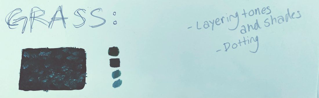
I experimented with how the grass would look. In Fir Trees at Varengeville the grass is very detailed. I didn't want the grass to be very detailed and take away from the other objects in the painting. Also since there was a lot of area that consists of the grass I also wanted a simpler way to go about painting it. So I wanted to try a more efficient way to paint the area, but without it looking too poor. I tested by painting an area of the base color, then adding lighter tints of the same color over it. I wanted to try a splotching stroke to give a fluffy grass look to give it a softer feeling (shown to the right).
|
|
Process
|
|
First I had to print out the section I wanted to use for the painting. I had to separate the image into four pieces so it would fix onto the canvas. The first prints came out too small and did not fit the canvas, so I had to repeat the process with larger sized images. Then I taped the correct sized pieces together and shaded the back of the papers with pencil so I could create my line drawing. I then drew over the important shapes and lines on the picture. After I completed this process I then realized the marking did not show up on the canvas at all. I was pressing the pencil into the canvas too lightly. So I repeated the process applying counter pressure to the canvas, this prevented me from pressing to hard into the canvas and damaging it. |
|
After I had gotten all of the reference lines on to the canvas I started with painting the sky. I mixed white and black to make a light gray, I also added a little blue. Although when I mixed the paints together I did not fully combine them, leaving some of the hues still intact. This created the horizontal lines of color in the sky. Since the day was still and there was no wind or clouds to indicate movement in the sky, I used long strokes for the sky making it look more still. While painting the sky getting closer to the horizon line I darkened the shades to indicate more depth. After I painted around the trees I saw that would be a problem, as there would be no sky behind the leaves. After I realized this I painted in the entire sky, the most visible part with the impressionistic style. I Then created the basic shapes of the tree trunks, as well as the trunks in the reflection. After I finished the sky all of my reference lines were, of course, gone. Once again I took my printed images of the section and traced the important shapes to have references for the more detailed work.
|
|
|
|
After I redrew all of the reference lines then I painted the variations in the background created by the fog. I used darker shades of the sky hues, also the same technique I applied with the sky for the variations. When I completed the variations I then started off the vegetation. I applied the techniques of small strokes of paint while layering between hues, tones and shades. I layered to give it more depth and also texture. I started off with the bushes and trees closer to the horizon with the darker colors then layered up to lighter colors. I continued this in the larger trees. After the trees were painted I then worked on the concrete. I used only grays with minor variations in shade, also using the long brush strokes. Next I added vegetation to the reflection. Then I painted the grass color and added a lighter version of that hue over it while it was still wet by blotting the paint on the canvas. This created many tints and shades with only two colors in use. After I finished the grass I repainted the trunks of the trees in a more toned down brown.
|
Reflection
|
I developed as an artist by learning new skills and application of paint. I learned from Monet's Impression Sunrise and Fir Trees at Varengeville. By studying the techniques used in the works and by altering them I created my own take on the impressionistic style. Learning these new methods of painting was challenging as I have never done anything like this before. Also getting my point across was a challenge as I wanted to give off a feel of familiarity rather than gloomy. I don't think I got it across as much as I wanted. I think I was successful in creating a monotone and softer looking work, but not a familiar feeling painting. It is gloomy feeling with all of the dark colors, which is more similar to the feel Sunny gives off. |
|
Critique
|
Impression Sunrise (1872)
|
Similarities:
-Gray tones used throughout the work -Brush stroke techniques (long and short) -There is similar subjects of fog and nature Differences: -The movement is different; in Impression Sunrise there is lots of movement shown through the brush strokes, while in Trees of the Lake it is very still -Color palette; Impression Sunrise uses grays, blues and oranges, while in Trees of the Lake there is blues, grays and greens -There is more open space in Monet's work, but in mine the objects are all very close together. |
Trees of the Lake (2020)
|
|
ACT Responses
|
Bibliography
|
|
|
|
|
1) Clearly explain and describe how you are able to identify the cause-effect relationships between your inspiration and its effect upon your artwork.
My inspiration was Claude Monet, his works influenced my work and how I made it. Monet's work had helped me solidify my ideas for my painting. With his works I finalized my theme of a familiarity, and his work inspired me to also use the impressionistic style he was famous for. 2) What is the overall approach the author has regarding the topic of your inspiration? The author from my research enjoys and appreciates Monet's work. They also have a the opinion that Monet is a revolutionary painter for the impressionism movement. 3) What kind of generalizations and conclusions have you discovered about people, ideas, cultures, etc. while you researched your inspiration? What I have learned is that there is many ways to look at the same thing, especially in impressionistic art. In some of Monet's more abstract work, for example Impression Sunrise, you can see different things away from the work. 4) What was the central idea or theme around your inspirational research? While researching I looked for works of art that looked similar to the original photo, Sunny. I also looked for paintings that contained similar subject matter. 5) What kind of inferences (conclusions reached on the basis of evidence and reasoning) did you make while reading your research? I infer that author has extensive knowledge on Monet's work and the techniques he used. |
N/A. (2016). Fir Trees at Varengeville by Claude Monet. Retrieved November 13, 2020, from https://fineartamerica.com/featured/fir-trees-at-varengeville-claude-monet.html
N/A. (2015). Impression sunrise. Retrieved November 13, 2020, from https://www.claude-monet.com/impression-sunrise.jsp |
