
Project One
|
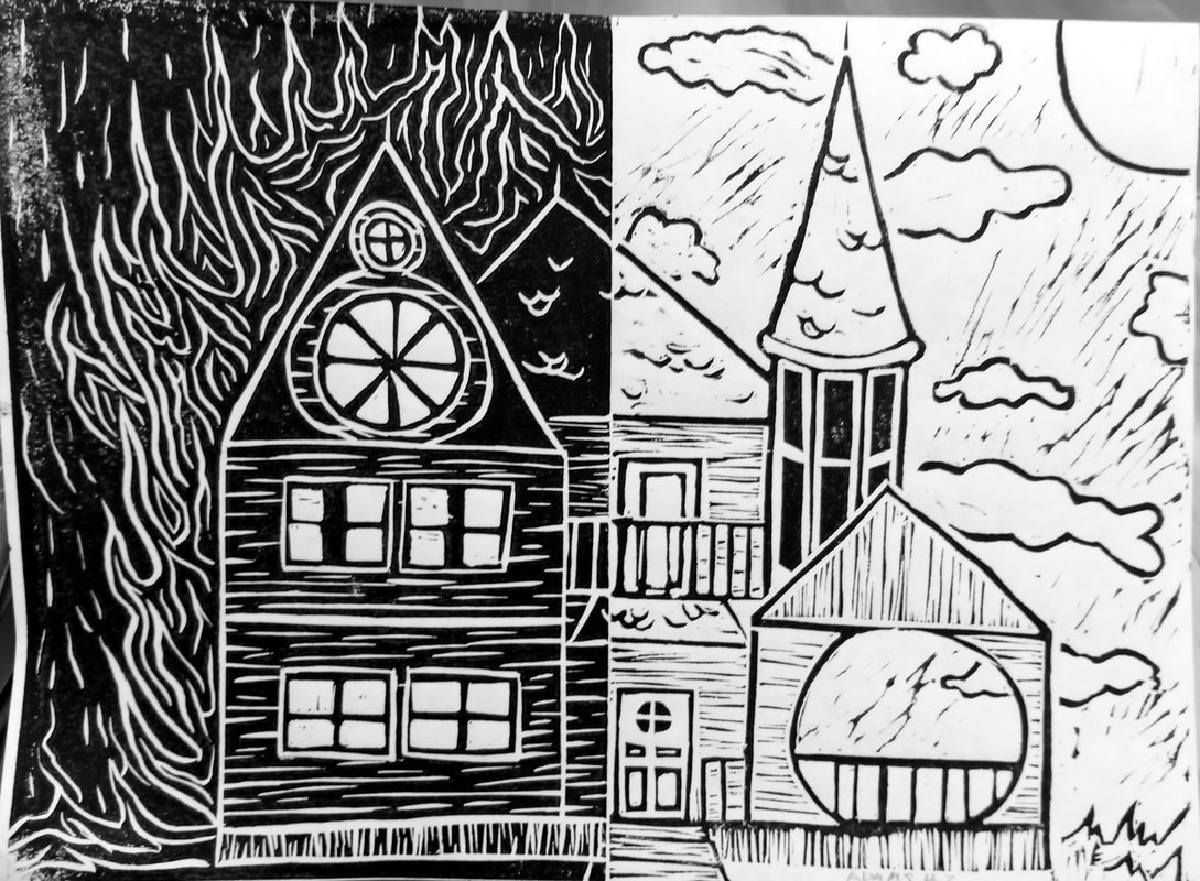
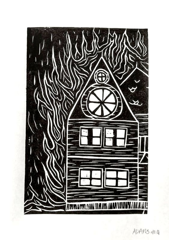
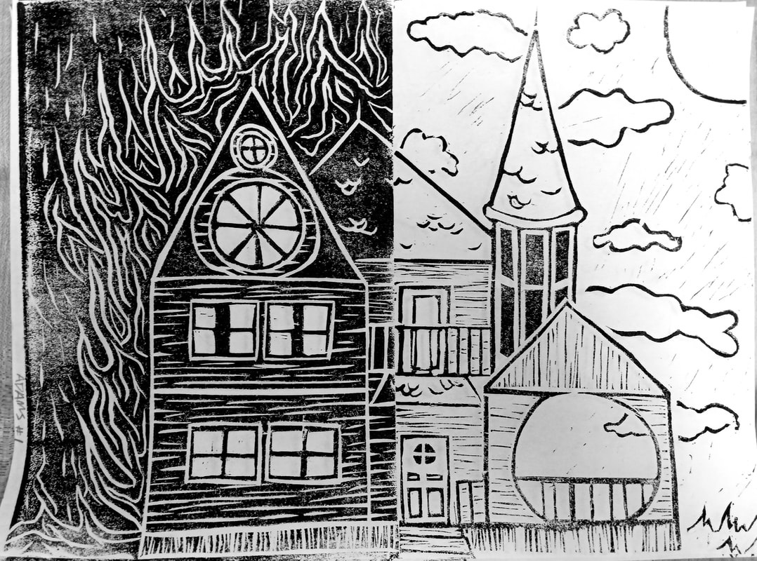
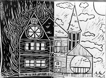
Burn it to the Ground
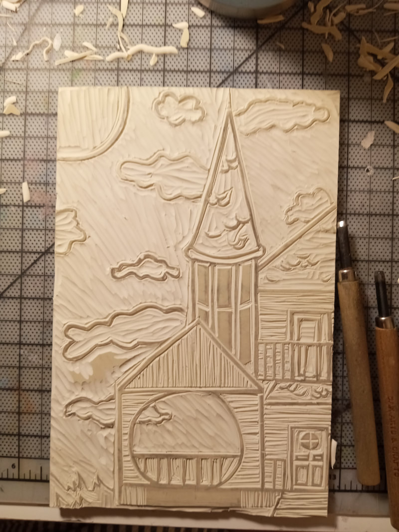
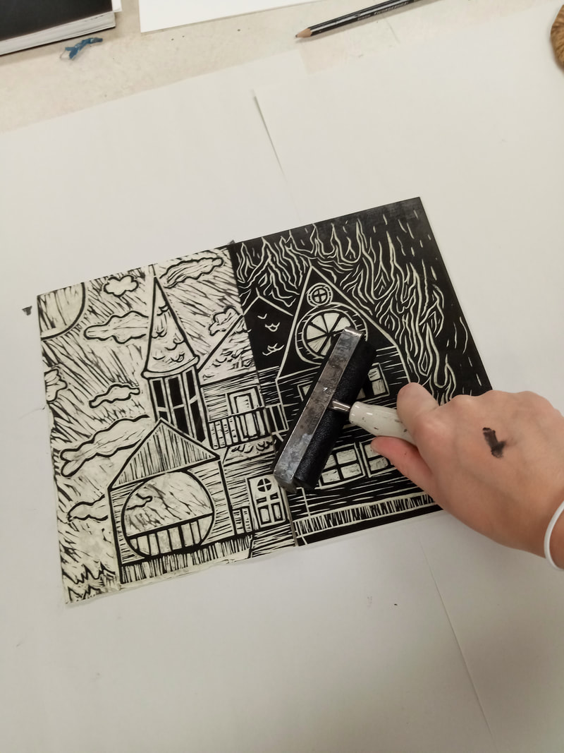
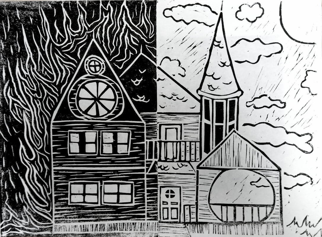
20cm x 28cm Block Print September 2021 This Block Print diptych takes inspiration form Matisse's block print book's simplicity and Thomas Berger Johnson's block print buildings' texture. I also took inspiration form the Victorian era Houses. They have so much character and have stories of their own to tell, that is why I find it so sad when old and intricate homes are destroyed. That history behind the building and those stories are gone forever. I wanted to show the stark difference of the alive house in contrast to the dead house. |
|
|
|
|
|
|
Inspiration

Mais soudain le soleil. No 1., 1943 by Henri Matisse
|
I was slightly surprised when I found Matisse's block prints, as I only knew him before as a painter, but he still utilizes simple forms and solid colors. This work in particular is very is off putting to me. The interesting form of the person at the bottom has no distinguishable expression, which makes me unsure of what the work is about. This is from his book of prints it is full of works the used only line to make the shapes. There is little detail other then the shapes. I like the simplicity of them and the pureness of the works, also the high contrast caught my eye. Although I enjoyed those aspects, them being mostly all black left much to desired for me. I felt as if I was missing out on possible detail. |
|
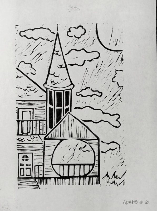
To combat that, I also used Thomas Berger Johnson and his use of extensive detail as well. There is a balanced composition throughout this work that is very tranquil to me. I think this is because of the stillness of the work. It is solitary, but not in a sad and depressing way. The building standing all by itself, worn and used, but remains upright; lasting the passage of time. That is what I enjoy most about old architecture, it is resilient and is a tell of the past. With the actual print itself I like the very minuscule black detail lines achieved, they give the grass and ground movement and made me want to create something with that affect. This helped me plan on how to achieve black lines instead of white ones, so I did not just use white lines to make shapes in my final product. |
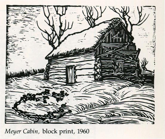
Meyer Cabin, 1960 by Thomas Berger Johnson
|
Planning
|
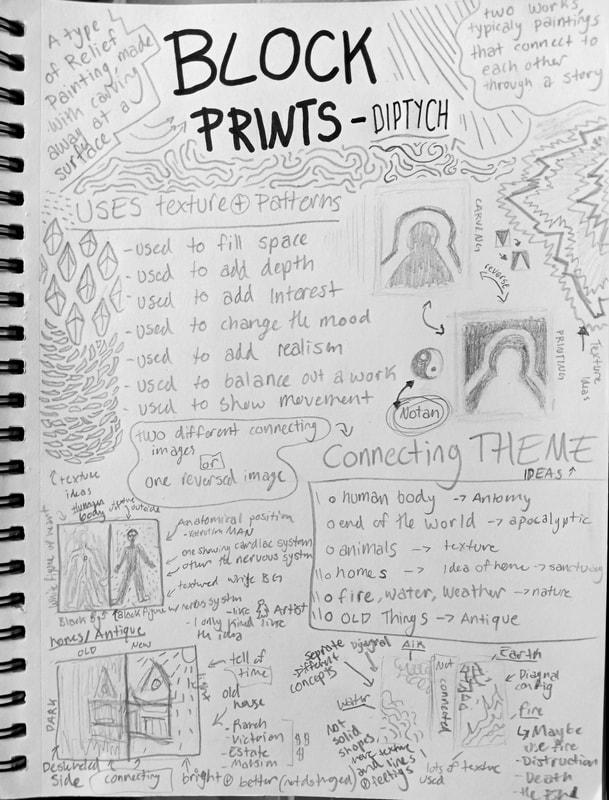
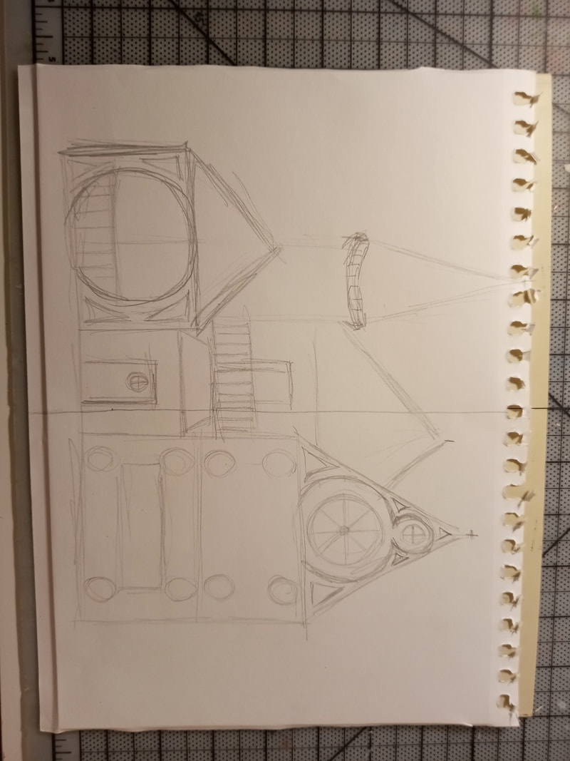
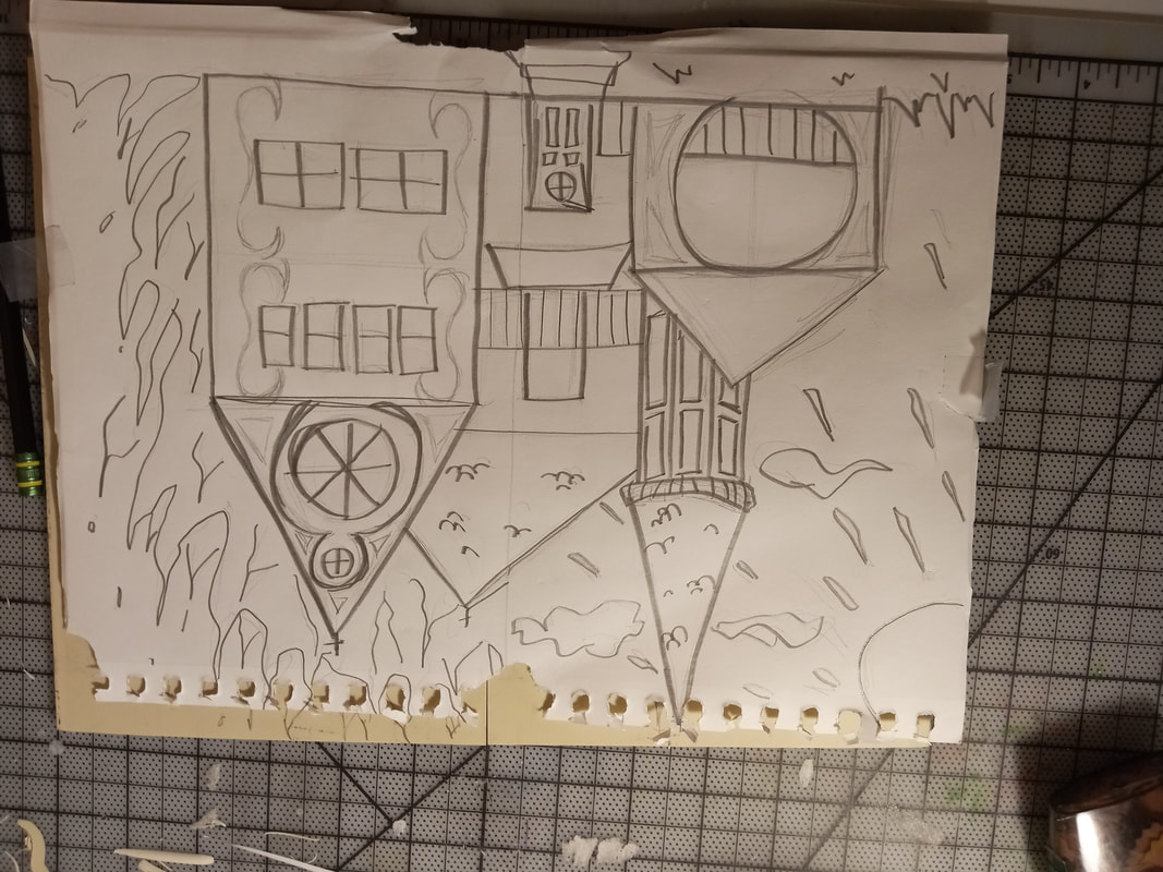
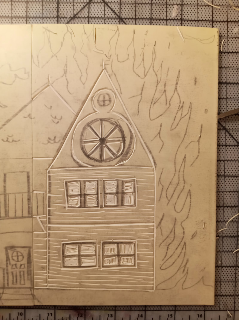
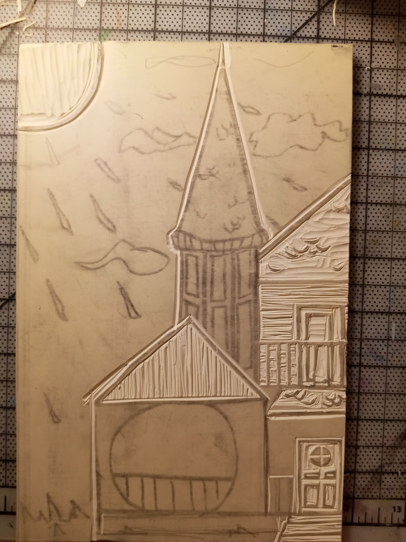
I first started out deciding I wanted to add another skill to my portfolio, Block Print. Also I wanted to see what I could do to create a multi-paneled work that had a connecting idea, or connecting imagery. From the start I wanted to include texture into the work, so the first idea sketch page (on the left) is mostly texture ideas or why to use texture. Here I also started to think of connecting ideas I could explore, in the end I chose: home, old and fire.I then sketched out what I could possibly use as the main subject matter in the print, or what type of house I should make.
|
|
|
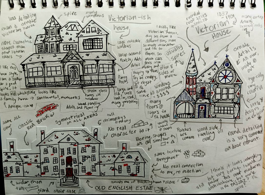
Since I was on the fence an which type I started describing the look and feel of each house type and narrowed down the search that way (to the top right). After exploring each type I found I like the Victorian house the most due to the charter is has.
I started with practicing on the medium and reflecting on how I used the tools. I planned out how to improve my use of them. I then finalized my idea and wrote out how I could incorporate my inspirations, just so I could stick to a plan, but still be lose when making. I also solidified what will be on each panel and how that connects and how they contrast. This last step was the most important to stick with and to plan out ahead of time. |
|
Experimentation
|
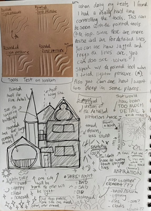
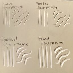
I did some practice tests to see how the medium worked before I started the actual project. I have never done a block print before, and I have never carved into linoleum, so it was a learning curve to figure out what pressure and depth worked the best for what I wanted to do. I also had little control over the tools as I stared. This is specifically shown with my practice with the pointed tool (at the top). Here you can see where the tool slipped, also where I did not make a smooth line. So it was better that I practiced before hand to get an understanding of what I was working with. This whole project was mostly experimentation and development of my skills. |
|
Process
|
|
Carving-
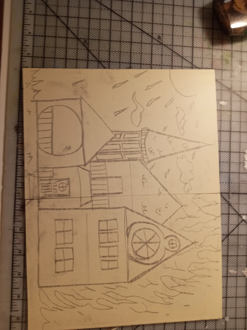
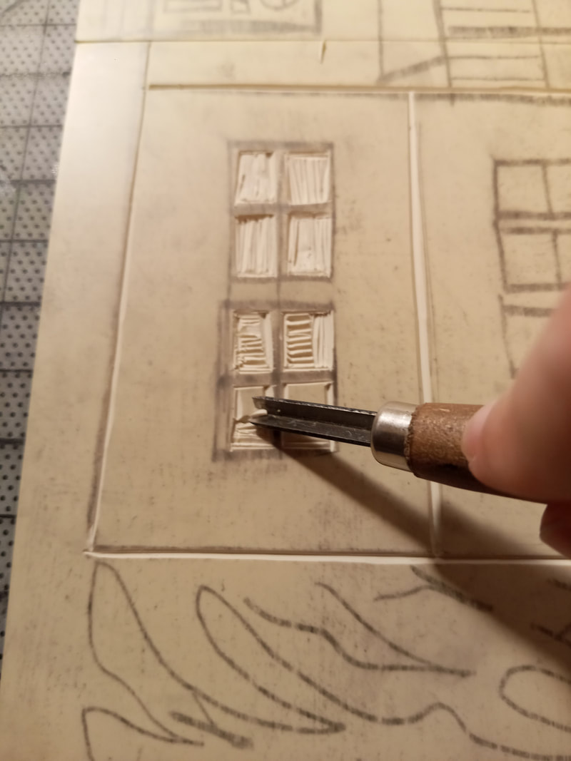
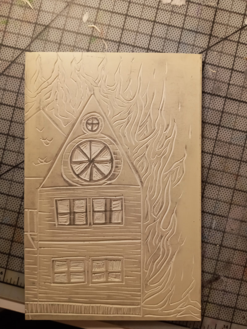
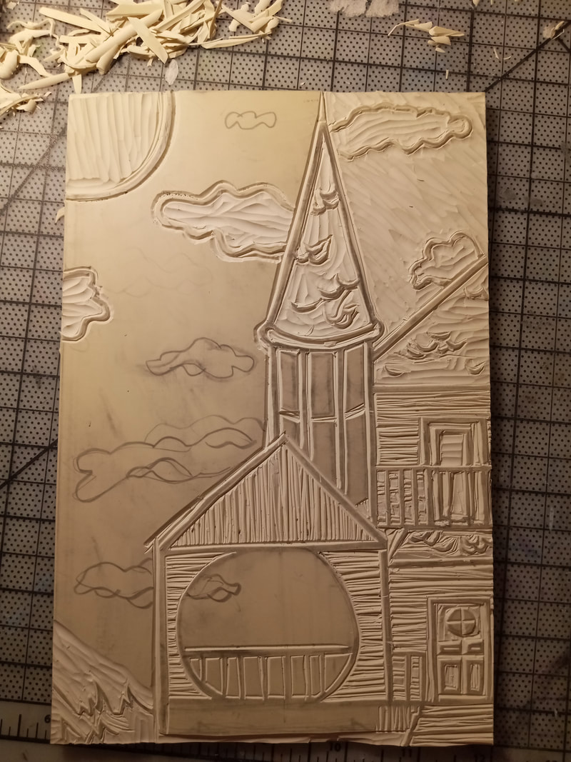
I started with drawing up my sketch then transferring it on the the linoleum panels, keeping them lined up together. My original sketch was highly detailed, just like a Victorian style house, but then I realized all the work I would put into carving the details out might not show up. I also was nervous about how I would do working with tools, even after experimenting. So I decided to cut out some of the detail to save the integrity of the general shapes so my idea would come across. The next step I took was carving out all of the lines on one of the panels, so black would be the main color. Then I continued onto the next panel, which was the mostly white one. This one was the challenge as I need to carve everything that was not my line work from my sketch. This side needed much more control of the hand for me to complete. |
|
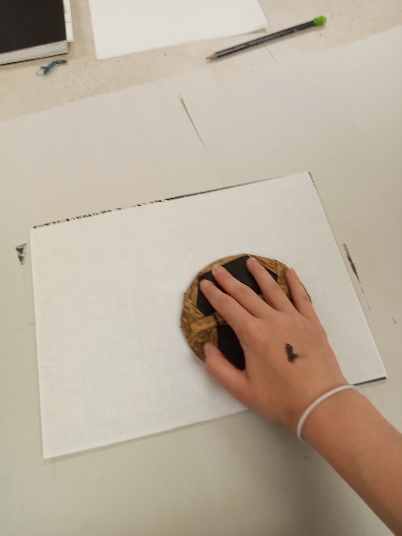
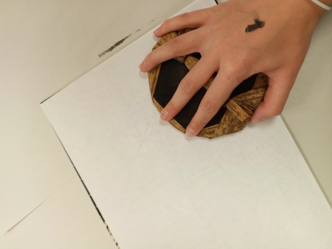
Printing-
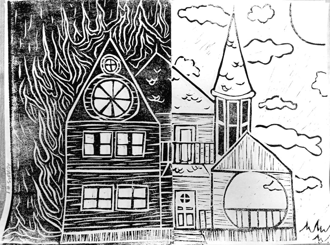
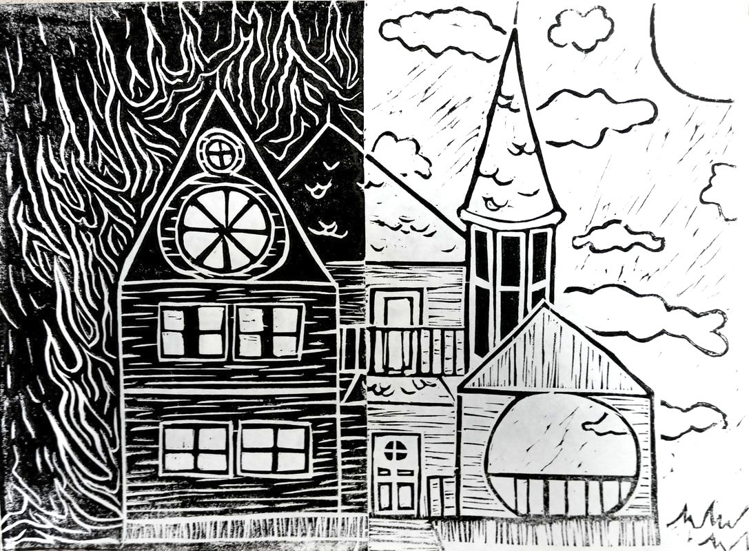
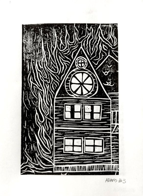
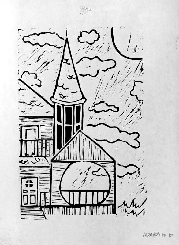
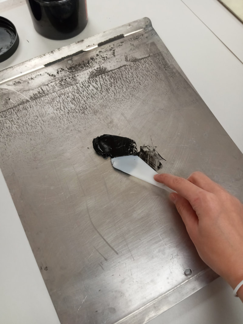
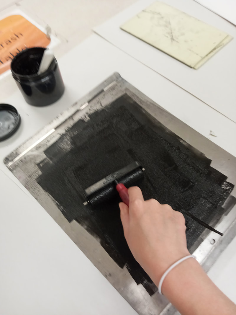
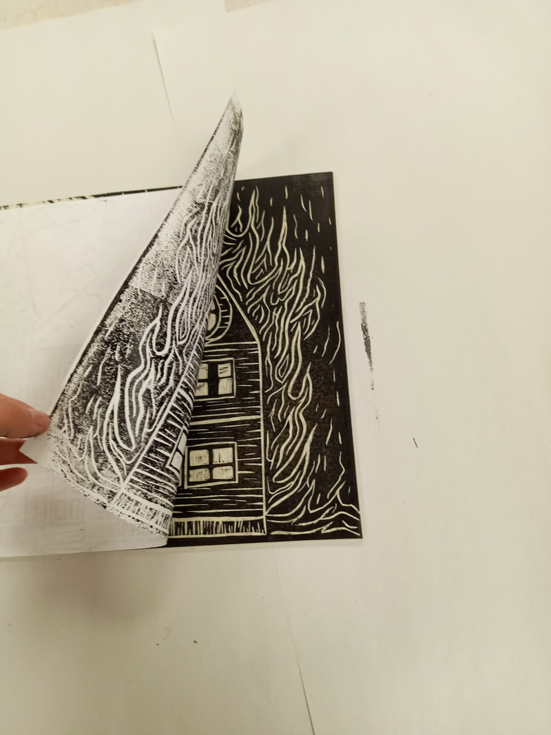
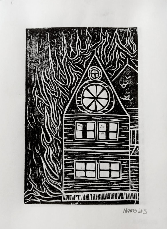
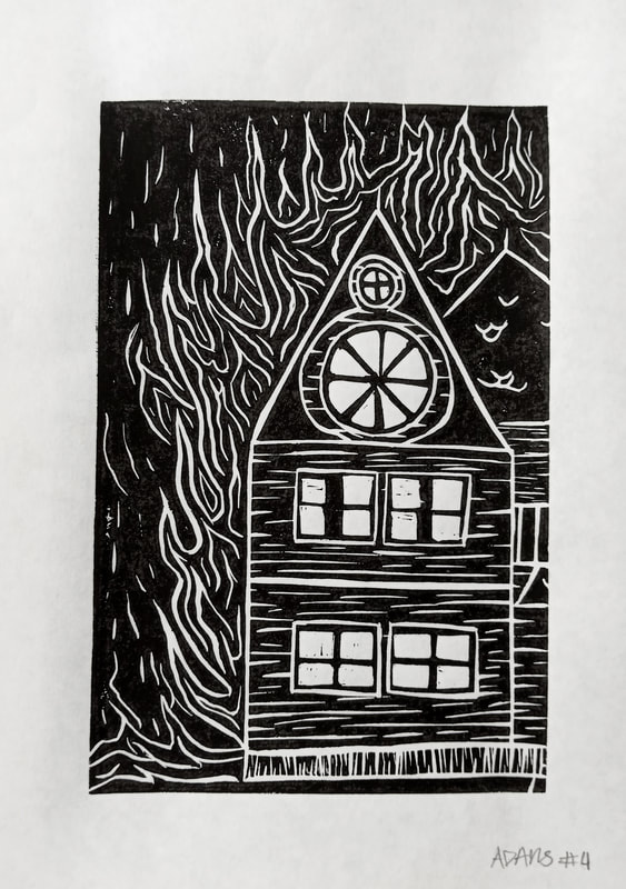
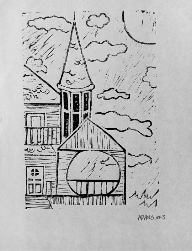
To make the prints I used water based ink and spread it even on a pan with a brayer. During this step the first few prints did not have enough ink on them and I was spread it too thin, causing an undesirable finish on the image. Next I rolled the ink on my two linoleum panels, side by side, to complete the whole image. Then I placed a piece of paper on top of the inked panels and used a baren to have press the paper into the ink evenly. This was to give a solid image and to make sure all of the ink I had on the linoleum cuts was transferred onto the paper. After that I pealed the paper up and revealed the final prints. Below you can see, in order, the 7 prints I did and how I improved over time with the quality of them. |
|
|
|
|
|
|
|
|
Reflection
|
|
This was an interesting project to do, as this was a new medium for me. I think I have developed more as an artist just from this project itself. At first it was a real struggle to even think about how to get my ideas out on to the linoleum. This was hard on the lighter panel in particular. But using Thomas Berger Johnson's work I could visualize how I would accomplish it. As that was part of experimenting, this whole project was mostly me building skills and technique to improve my self as an artist and to broaden my abilities. I enjoyed this most about this project finding solutions for problems and moving on. I also want people to see the extreme contrast in the two panels and at least get a feel of an end for this building. Hopefully people will see my point of view on the destroyed house.
|
Critique
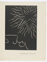
Mais soudain le soleil. No 1., 1943 by Henri Matisse
|
|
Similarities:
-Both use linoleum and are Block prints that use black ink to expose the carved away sections. The minimal use of carving is seen in both works, leaving mostly black (specifically the the left panel in my work).
-There is similar shapes used that were created with line. The star in Matisse's work and the fire in mine share a resemblance in the technique used to create the wavy and irregular marks.
-The dark mood that is from in the older print and in my left panel is very similar. They are both mostly black with white detailing, Which instantly gives a darker mood, but the imagery they depict also add to that. Matisse's print uses sharp angles and a distorted figure at the bottom, Mine also has sharp angles and flames engulfing a house.
Differences:
-Matisse's print uses only white line (negative space created with carving) minimally to create the shapes in his work. While mine uses that on one side and and extensive amount of carving on the other to create line to form shape.
-The house in my block print uses texture in the wood grain of the house, in the fire, in the shingles, and in the background. Matisse's has little texture throughout the work.
-The mood and subject matter is very contrasting as well. The 1943 print is jarring and has imagery were the meaning is blurred. It also has an off putting vibe with the strange figure and shinning star. Mine has a clear contrast that is formed with the visual elements and mood from the house, the fire, and the calming background.
|
ACT Responses
1) Clearly explain and describe how you are able to identify the cause-effect relationships between your inspiration and its effect upon your artwork.
My inspirations were able to push me into the right direction, which allowed me to produce a final project. 2) What is the overall approach the author has regarding the topic of your inspiration? Both authors used an unbiased tone which allowed them to be informative and positive about the work. 3) What kind of generalizations and conclusions have you discovered about people, ideas, cultures, etc. while you researched your inspiration? There is many different ways to do things, in art and in life, but also different way to see things. 4) What was the central idea or theme around your inspirational research? Technique and use of the medium drove my research. 5) What kind of inferences did you make while reading your research? I assumed, at first, that there was a set style of block prints, but then after researching I then concluded that there is no set way to do prints. |
Bibliography
History Nebraska. “Thomas Berger Johnson Block Prints.” History Nebraska, n.d., history.nebraska.gov/collections/thomas-berger-johnson-block-prints.
MOMA “Henri Matisse. ...but Suddenly the SUN, Shaking Its Mane... (...Mais SOUDAIN LE SOLEIL, Secouant Sa CRINIÈRE...) (Plate, Page 43) from Pasiphaé: CHANT DE Minos (Les Crétois). 1943–44, Published 1944: MOMA.” The Museum of Modern Art, n.d., www.moma.org/collection/works/28303. |
