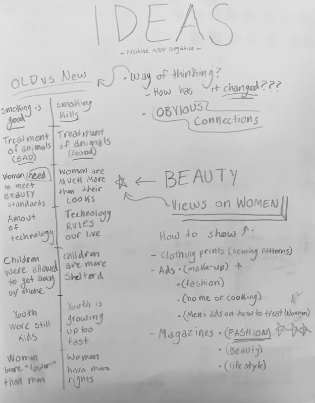
Opposites -
|
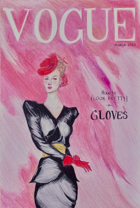
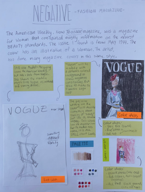
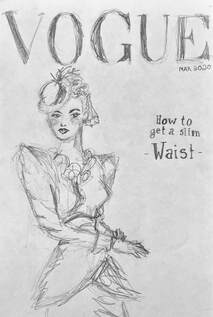
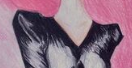
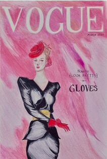
Gloves 25.5cm x 38cm Color Pencil on Illustration Board November 2020 This work is part of a two piece collection in which I used two magazine covers, from different centuries, as inspiration. One was illustrated by David Wright for The American Weekly, May 1944; the other photographed by Ethan James Green for Vogue, March 2020. For these works I interchanged the models of the covers to send a different message to contradict the one being sent to women of the respected time periods. Instead of women being told to look pretty in 1944, they are being told in 2020. |
Inspiration

The American Weekly Charm May 1944 Cover By David Wright
|
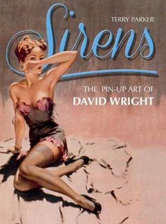
Sirens Book of David Wright's pin-up art
by Terry Parker |
My two inspirations were magazine covers of the notorious VOGUE and The American Weekly, now Charm magazine. The magazine cover from The American Weekly, May 1944. Or more commonly known as Charm magazine. Being that the issue was released in another time period that has contrasting views to more modern media, I though this was a perfect way to compare the two. Charm always had more of a vanity driven focus.
To the left is some of David Wright's work. I used his artistic style, he used in the 40's, for inspiration. I determined that the softer and realistic look of the models he portrayed would deliver my intended message that even now in 2020 much of the media still only focuses on vanity and looks. |
|
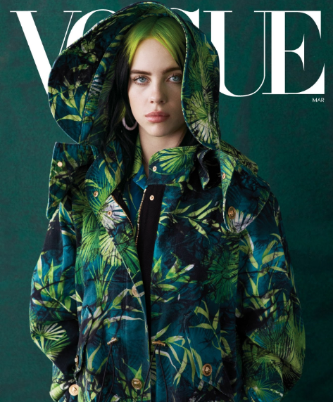
My other inspiration was another magazine cover from VOGUE. Ethan James Green photographed Billie Eilish for VOGUE's March 2020 issue. The singer was on the cover due to the storm she has created in the music industry, or as the issue cover revivals, how she "Reinvented Pop Stardom". More recent issues of VOGUE have left behind the old idea that beauty is everything. Now VOGUE focuses on lifestyle and fashion instead, this March 2020 issue is an example. I used the title and purpose of VOGUE as inspiration. |
|
Planning
|
I knew from the beginning I wanted to compare older ideas and concepts to modern thinking and views. I also wanted to depict how older ideas v.s. modern ideas have changed, or have not changed. My overall concept was that older media emphasized that women and girls must follow and meet the beauty standards, while most modern media communicates that women are much more than their looks, and can do much more. After deciding on my message I wanted to find a form of media that influences the population and has a wide range of views. I decided on magazine covers because they are simplistic and get to the point about the topics and purpose of the text. |
|
|
For this work I wanted to go more toward the negative side of things. In the beginning I wanted to change the background to make the work dark in itself, but deiced against it because the negative messages I wanted to get across could be done with the original background. The point I wanted to get across is that even though we as a society have come a long way from completely objectifying women, like in old ads and magazines, it still happens. This is depicted in the way this work is set in 2020, but still has a focus of vanity and looks only. |
|
Experimentation
|
When creating this work I wanted to do an exaggerated version of the sketchy look David Wright uses in The American Weekly May 1944 issue. When he depicts the clothes there is many lines and shapes which illustrate the folds and shadows of the dress. This was a stylistic choice on my part. I really just enjoyed exaggerating how the fabric flows on the model. |

|
|
Process
|
|
First I sketched lately my plans for the illustration. After that I refined the details and then proceeded to sketch lately the shapes of the background. Then I blended different tones and shades of tan and brown to create the neck. I continued the same process, for the face, blending Until a smooth contorted face was formed. I used the pointy tip of a pencil to create the finer details. I then began to draw the shadows and highlights of the dress, while using grey for the middle shade. I continue the process of quick scratch marks to create the folds in the dress following the curve of her body. After finishing the dress I moved on to the gloves. I layered a variety of reds to create the bright gloves. After finishing the gloves I outlined the title: VOGUE in a light pink, same as the background. I then continued to layer different shades of pink and peach to get the variety that is seen in the background of the magazine. I then went back to finish the hat, with the same reds I use the gloves, once again layering to add depth. After completing the hat, feathers and ribbon I moved on to the hair. The short and curly hair is created by short small dashes layered in browns and tans. Then I completed the belt by again layering with yellows and browns. After I completed the belt I finished off the background with the same technique as before.
|
Reflection
|
I changed as an artist by learning new skills and by gaining opinions as a person. I gained inspiration on how to improve from David Wright's work. Looking at the techniques he used in the work and by exaggerating the lines and shapes I produced my own take on the early 1900's style. Learning how to effectively use colored pencils was challenging because I have never used them in that way before. I also think that keeping the work consistent was challenging. I enjoyed coming up with the idea and forming my own opinion on the matter, but as I found it challenging I did not enjoy working with the medium. Even though I am not in love with this work I want others to take away that even though the media has changed some, it is still geared towards vanity, looking perfect, following the beauty standards. This creates problems that are visible in young girls and women all over, especially in the U.S.. There is more to a person than looks.
|
Critique
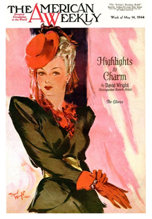
The American Weekly Charm May 1944 Cover By David Wright
|
Similarities: -The color palette is similar -The orientation of the model is the same -The mood the colors create is the same, it is soft and calming to look at Differences: -While in the illustration by Wright, there is more of a softer look and less harsh of a tone, my work is very concentrated -Wrights work was meant to have a positive meaning, and had a purpose of entertainment, while mine has a less pleasant meaning |
Gloves
|
|
ACT Responses
1) Clearly explain and describe how you are able to identify the cause-effect relationships between your inspiration and its effect upon your artwork.
My inspiration was David Wright and Ethan James Green, their work influenced me in terms of process and formulation of my art. Their work led me to new conclusions about . 2) What is the overall approach the author has regarding the topic of your inspiration? The authors from my sources were all very enthusiastic about the topics; that being David Wright, Billie Eilish or vintage magazine covers. They were knowledgeable and gave a new insight into the topics for me. 3) What kind of generalizations and conclusions have you discovered about people, ideas, cultures, etc. while you researched your inspiration? I have developed my own opinion on the way women were portrayed in the early 1900's media and today's media. A generalization I have come to is that women were treated as if their beauty only mattered, and things have not changed very much today. 4) What was the central idea or theme around your inspirational research? The theme was connections to the portrayal of women in the media and the connection between older forms of media to newer. 5) What kind of inferences (conclusions reached on the basis of evidence and reasoning) did you make while reading your research? While reading and doing research I concluded that not to much has changed in what the media tells women, and that vanity is still considered very important; in most modern media. |
Bibliography
Haskell, R. (2020, February 3). How Billie Eilish Is Reinventing Pop Stardom. Retrieved November 29, 2020, from https://www.vogue.com/article/billie-eilish-cover-march-2020
Jang, S. (2017, February 14). Sirens: The Pin-Up Art of David Wright. Retrieved November 29, 2020, from https://retrenders.com/2013/10/02/sirens-the-pin-up-art-of-david-wright/ MagazineArt.org, N. (2009). American Weekly 1944-05-14. Retrieved November 29, 2020, from www.magazineart.org/main.php/v/general/massweeklies/americanweekly/American+Weekly+1944-05-14.jpg.html The Moscow Times, N. (2020, November 29). 16-Year-Old Russian Artist Lands Vogue Cover With Billie Eilish Drawing. Retrieved November 29, 2020, from https://www.themoscowtimes.com/2020/02/04/16-year-old-russian-artist-lands-vogue-cover-with-billie-eilish-drawing-a69154 |
